In this tutorial, I will show you how to make a responsive card using just HTML and CSS.
A responsive card is one that looks good on every size screen. We can accomplish this by using flexbox, relative heights and widths instead of absolute measurements, and also @media rules to define CSS properties to take effect only on specific screen sizes.
The HTML
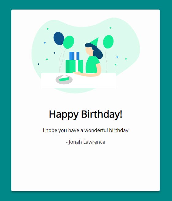
Here we have a simple card. Inside, we have an image and some text.
<div class="card">
    <img src="./birthday.svg" alt="birthday" class="birthday">
    <div class="text">
      <h1>Happy Birthday!</h1>
      <p>I hope you have a wonderful birthday</p>
      <p>- Jonah Lawrence</p>
    </div>
  </div>
Relative Sizes and Flexbox
Here I have set the height to 85vh (85% of the viewport height) and the width to 80vw (80% of the viewport width). Using relative measurements like this instead of absolute measurements (ex. 800px) allows you to have elements that stretch and shrink depending on how large the screen is.
Using flexbox, we can spread the elements in the card across the height or width. We can also use this to center them vertically and horizontally. I recommend checking out Flexbox Froggy by Codepip for an interactive way to understand how flexboxes work.
By default, the flex direction is row (left to right), but you can overwrite this by using flex-direction: column (top to bottom). Now our image appears on top and the text appears on the bottom.
.card {
  height: 85vh;
  width: 80vw;
  display: flex;
  flex-direction: column;
  justify-content: center;
  align-items: center;
  text-align: center;
}

@media Rules
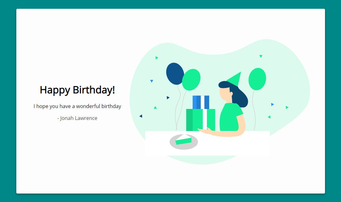
When the screen is at least 1000px wide, we don't need to keep the image on top anymore, we can put it side by side with the text.
Using a @media rule like the one below, when the screen is a minimum width of 1000px, the flex-direction: row-reverse will be applied to .card causing the flexbox to place items right to left (the image on the right and the text on the left.
@media only screen and (min-width: 1000px) {
  .card {
    flex-direction: row-reverse;
  }
}

On very short devices such as phones in landscape, we may want to use this landscape layout as well, so we can use the following rule using max-height.
The CSS properties inside this rule will only take effect on screens with a maximum height of 640px.
@media only screen and (max-height: 640px) {
  .card {
    flex-direction: row-reverse;
  }
}

Demo
Try running the demo below at 0.5x or in a new window to see the effects.
Resize the viewport to switch from portrait view to landscape view.
Watch the full tutorial
In this video, I walk through the full process of creating this demo from scratch.
For a full understanding of how I designed this responsive birthday card, be sure to check it out!
About me
My name is Jonah Lawrence and I am a full stack developer.
You can find me on:
YouTube 📺 youtube.com/DevProTips
Twitter ✍ twitter.com/DenverCoder1
Github 👨💻 github.com/DenverCoder1
If you like my content, be sure to react, like, and subscribe to my channel!
